Studying Facebook ad examples is the best way to learn new ways to improve your Facebook marketing.
Not only will you gain insight into what your competitors are doing, but you’ll also catch a glimpse at some of the latest (and greatest) design and copywriting ideas used by industry leaders.
What you’re about to see are screenshots of actual ads that have been used on Facebook. So, start browsing to get your inspiration and strategy for your next Facebook advertising campaign.
If you’re looking for Instagram ad ideas, check out these XX Instagram ad examples.
As you read through this article, you will:
- Learn about ads that are performing well on Facebook
- Discover new ideas to design and write your own Facebook ads
- Start your next Facebook ad campaign with confidence
How to get the most from this article:
If you discover any Facebook ads that are relevant and inspiring, you should:
- Analyze what made the ad so good was it the image, the copy, or both?
- Practice replicating the ad by making it relevant to you and your business
- Download the image and save it to a swipe file for future reference
Ready to see some Facebook ads? Let’s get started!
#1: Moo.com
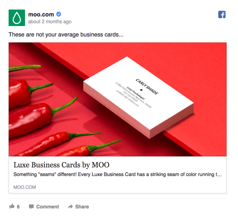
Moo’s ad is pretty hot!
Why is this ad so good?
Moo does a stunning job at grabbing your attention with the fiery red exploding from this ad. From a design perspective, the color palette with a hint of green takes offers a striking contrast to their offer: Luxe Business Cards.
#2: Neil Patel
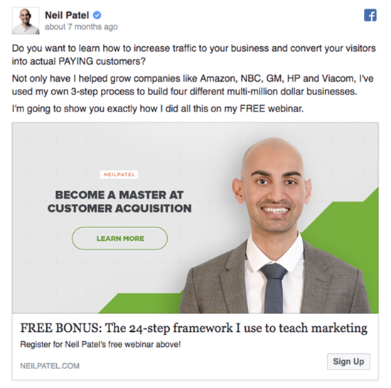
Free stuff + wise words from a digital marketing master.
Why is this ad so good?
Adding the word “FREE” to any ad is a sure way to grab the interest of people casually browsing their Facebook feed. Neil Patel’s personal and first-hand experience approach lets you know that you’re getting real help from a guy who’s been there and done it all before. Can you pull off an ad like this one?
#3: Nike
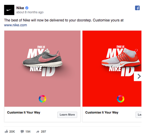
Great way to utilize a Facebook carousel Ad
Why is this ad so good?
Here’s an engaging way to showcase a range of products that offer their customers the power of customization. The high contrast colors emphasize what the ad tells you it can do. And, the copy is kept short and concise telling you exactly what you’re going to receive at your doorstep: Nike’s best.
#4: SaneBox.com
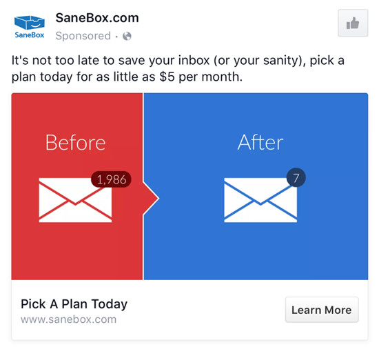
Great use of visualization to capture the company’s main feature
Why is this ad so good?
Look how SaneBox creates a strong compare and contract in their visual design. The color palette is simple and the main point pops. The copy is also a great example of copy that is both branded to the business and speaks to those who see the ad about a common problem.
#5: WP Engine

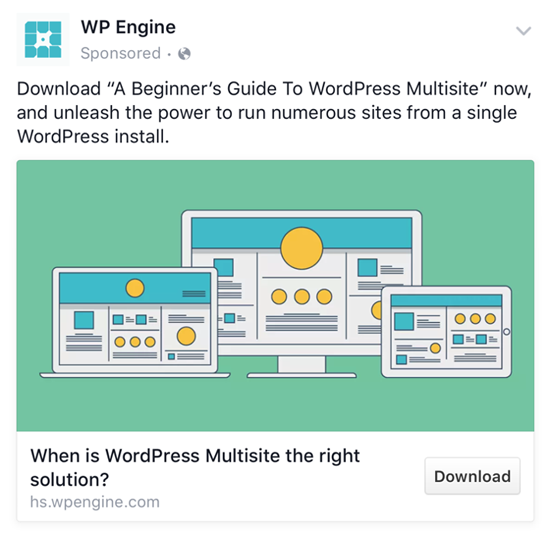
Address a problem your customer may have
Why is this ad so good?
Here, the ad copy and the ad image are perfectly congruent. When adcontext congruency is on point, there tends to be a higher engagement and effectiveness for getting prospective customers to take action. Another effective feature found in this ad is the focus of a customer problem. Connect with a customer’s pain points and they’ll soon come searching for the solution.
#6: Adobe Stock
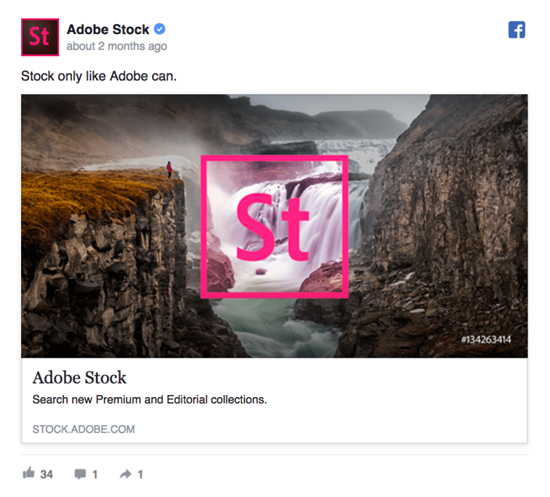
Keep it short and sweet and stunning
Why is this ad so good?
Adobe gets right to the point about what they have to offer. If you can get your message across to people looking at your ad using the smallest sentence possible, that’s good.
#7: Canva
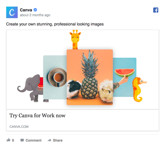
Simple.
Why is this ad so good?
Unlike all the other ads you saw before, Canva uses a plain white background to get their add off the page and in your face. You can probably use Canva to design a similar ad just like this one.
(FYI – that’s not a sponsored link for Canva… we think this is an incredible tool to design great images for Facebook ads, for free, and we had to share it!)
#8: MeUndies
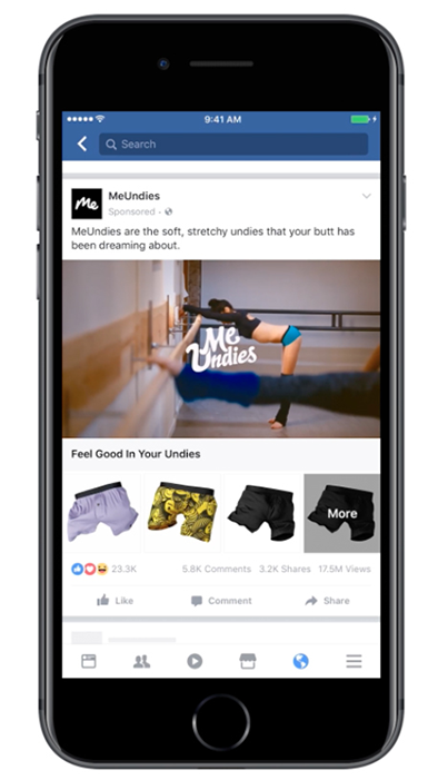
Tell a (funny) story with video ads.
Why is this ad so good?
MeUndies hit the mark and the money with this video ad for mobile devices. According to Facebook, this ad resulted in a 40% conversion rate, 47% increase in new subscriptions, and 44% in new customers. You can calculate exactly how much that is with this: they reached 1.5 million people! Imagine being this bold with your video ads.
#9: Air Asia
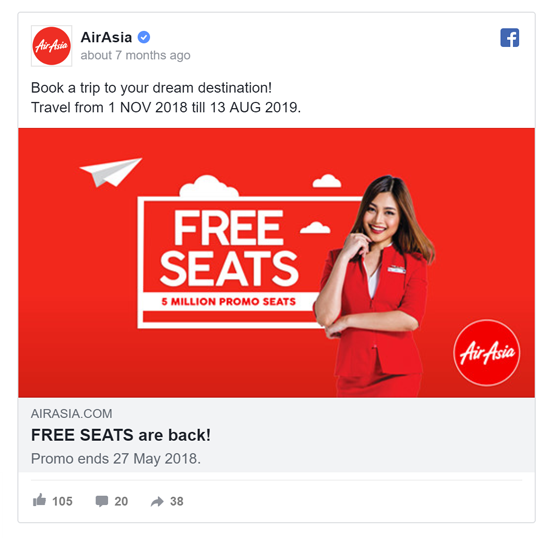
Unleash the power of limited time offers
Why is this ad so good?
There’s obviously something powerful with this coca-cola color red; it screams for attention. Look at how FREE is in caps in both the ad description and right in the center of the image. Do you see what your eyes just did? They see the FREE then quickly read the beautifully simple text to understand the offer.
This list of Facebook ad examples is just the beginning to what you can do to refine and improve your Facebook advertising. Let’s wrap this up with a quick summary you can take away:
- Use bright colors to direct attention to your message
- Everybody loves free stuff, what can you offer?
- Carousels allow you to showcase any customization features you have
- Address a problem your customers have
- Adcontext congruency conversion
- Sometimes a powerful picture can make a lot of noise
- Focus the message in your image by using a white background
- Be daring and use humor to drive your sales
- Limited time offers will never get old
Need some help with your Facebook ads? Get in touch and let’s take your customers on a conversion focused journey! voymedia.com
The post Best Facebook Ad Examples appeared first on Facebook Advertising Agency | Facebook Marketing Company.
from
https://voymedia.com/best-facebook-ad-examples/
No comments:
Post a Comment